)
)
)
)
)
)
)
)
)
)
)
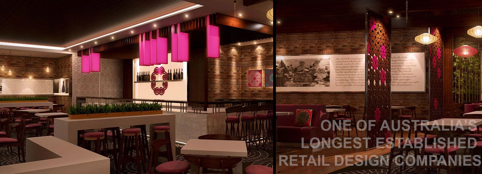
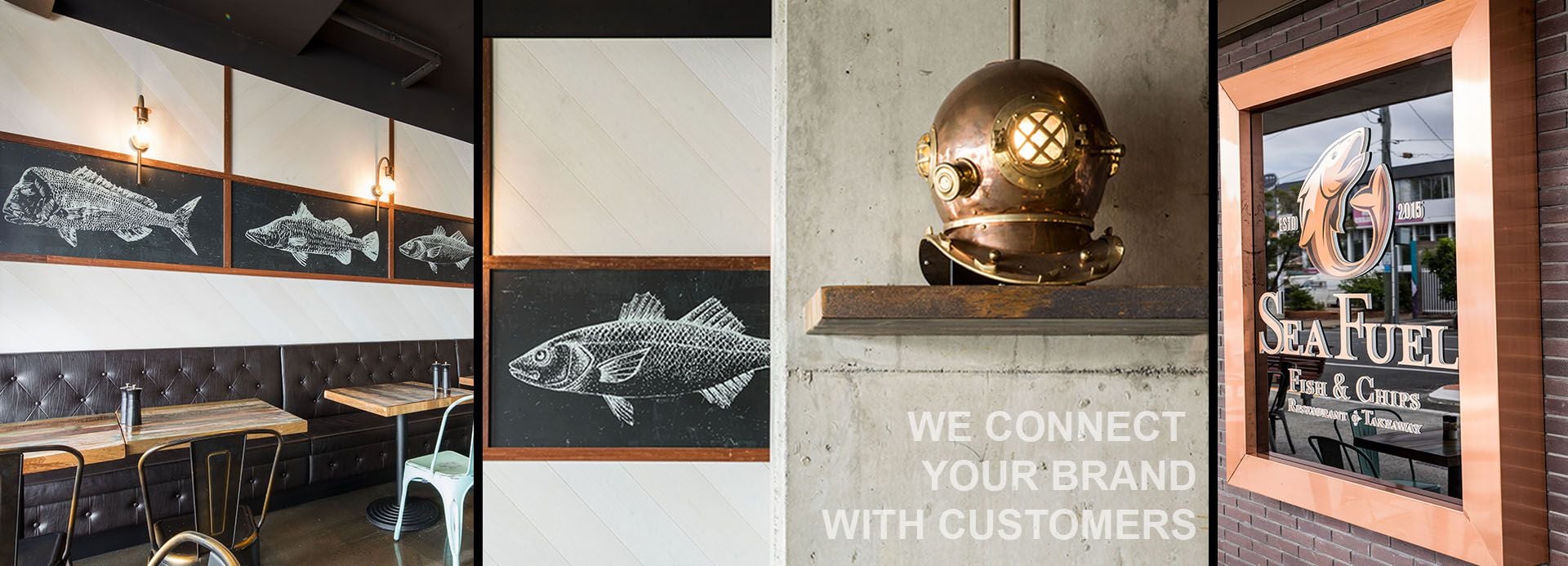
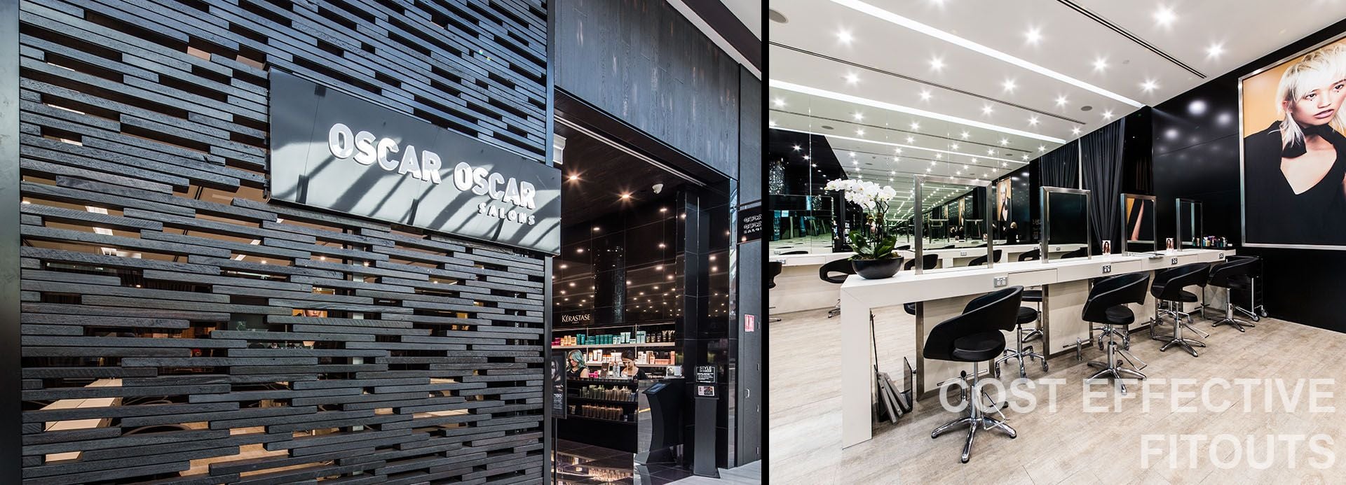
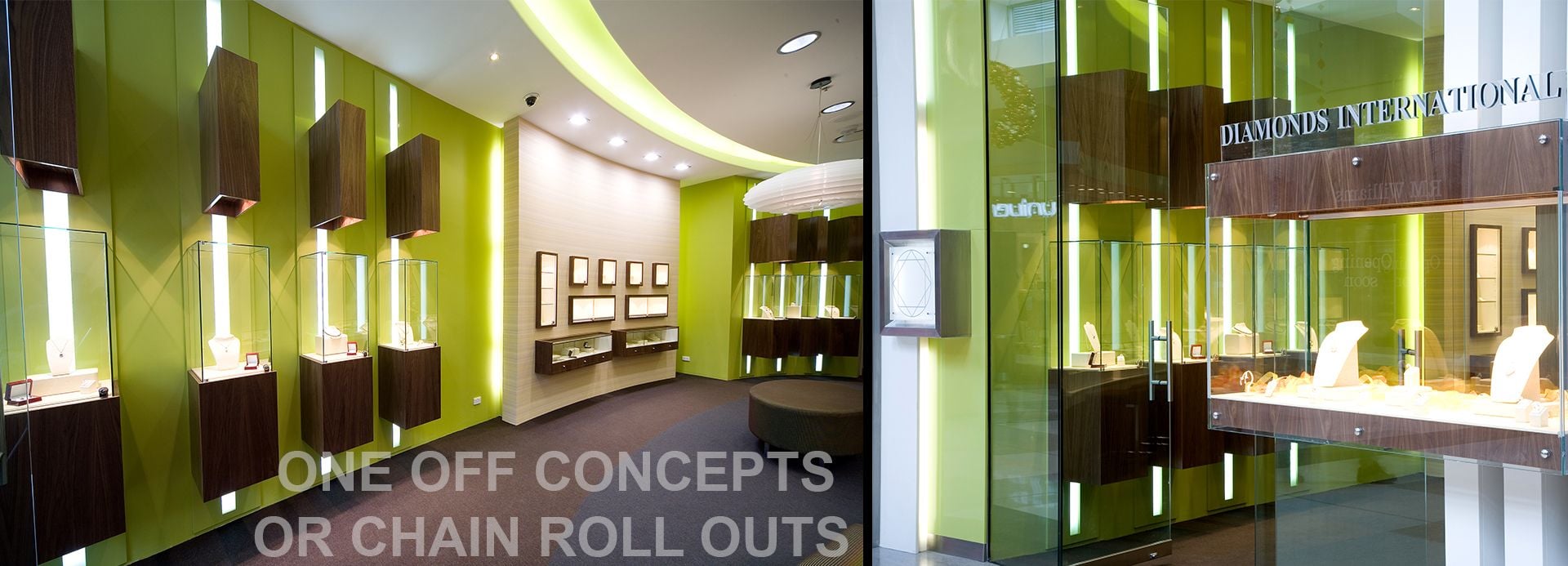
When it comes to retail, restaurant, beauty salon or any commercial adventure for that matter first impressions count. You only one chance to make the impression one that will WOW.
Let's face it competition is steep, no matter what retail or customer service business you are in, so a great first impression is critical in attracting new customers.
There are literally multiple choices when someone is looking to buy a product, find a new hairdresser, experience a gastronomical delight or find that special gift for that special occasion. So, how do you get a competitive edge here? You have to grab people's attention, stand out and deliver a great experience from the very first encounter.
Your storefront should provide you with the opportunity to attract and entice people to stop, look, engage and do business with you. If conversly, your shop or restaurant front looks old and tired, is poorly designed, and fails to give passers by an enticing 'preview', of what to expect, then they'll keep walking.
Here is just a few Ideas for you to consider to ensure the design of your shop front is attracting and not leaking customers for you.
For any retail fitout, one of the most important aspects of design is standing out and being visible.
Well positioned lighting, uniquely branded graphic displays, well-lit signs, active screen displays in your storefront, are just a few critical factors for success in getting people to stop engage and be attracted to your products and service offerings.
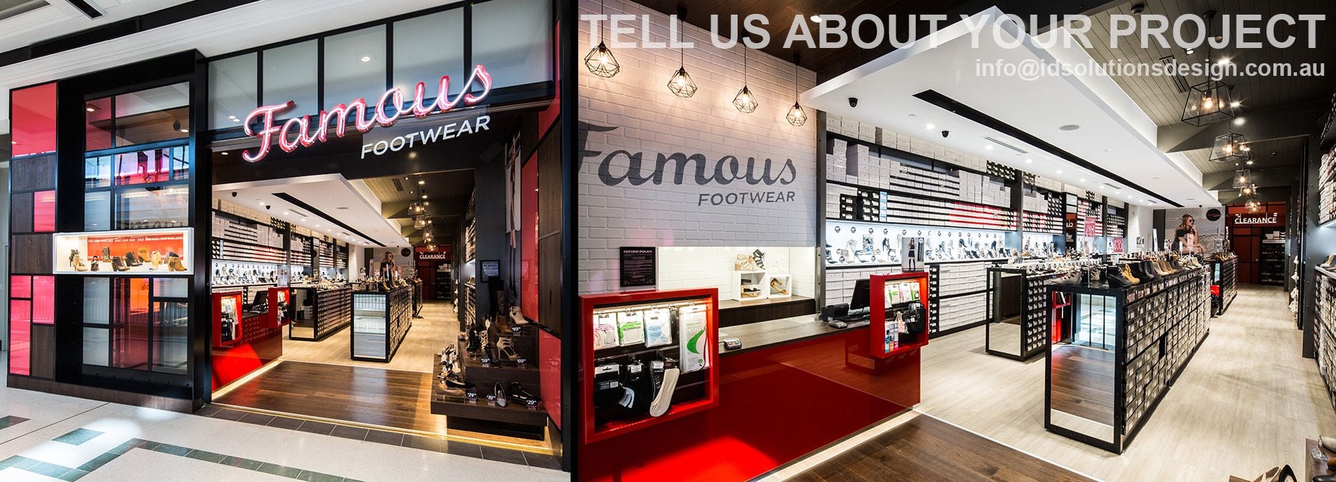
Neon look LED signs are a great way to distinguish your storefront immediately as are vibrant active large screen displays about your business.
Don't overwhelm them.
As shoppers approach your store or restaurant you want them to be able to see very clearly what offers, specials or 'looks' you are offering. Unfortunately too often these days a retail design is not well thought out and can be overwhelming. You need to be laser focused and not have the proverbial '12 desperation signs' that say "sale on now" or "last chance". Have a targeted, laser focused yet subtle approach in your retail design. Attracting customers is all about them feeling like they are special and being invited in. Warm and friendly!
One of the more important aspects of any good retail design is consistency particularly if you have more than one location.
You need to ensure that when people comes across your business in another location they can clearly identify it as your unique brand.
This definitely speeds up their buying decision, particularly if their experience has been great in the past.
If you have specials, sales or are featuring a new season product line or item on your menu, make sure this is represented identically across sites. And make your that your signage is identical.
When a potential customer views your retail sapce you don't want them to be bombarded by racks or shelves of products.
Create an open, welcoming space that allows them to take in the best of what you have to offer and be immersed in your brand.
This allows people to naturally transition from your storefront to the inside of your business. This encourages their purchasing journey to naturally flow inwards, not outwards
First impressions last a lifetime, whether it is meeting a new friend or an interaction with a new brand for the first time. The importance of retail design can't be underestimated when it comes to attracting new customers. Follow these tips to ensure that your space is designed and optimised to attract as many new customers as possible.
| Posted in:ANNOUNCEMENT |
)
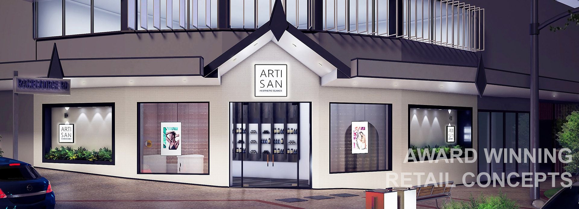
Time to rejuvenate you! Artisan Aesthetic Clinic located in Racecourse Road, Hamilton has created an inspiring clinical design experience for their clientele.
They offer a range of non-invasive cosmetic treatments from anti-wrinkle injections and dermal filler, to laser skin rejuvenation.
The clinic is founded on the Artisan Institute, their very own professional medical body for all of their doctors, nurses and dermal clinicians.
Led by their very own medical board, they are at the forefront of ensuring best practice across the Artisan brand of clinics through research and development, liaising with regulatory bodies. The Artisan Institute drives high standards of clinical safety, training and care.
In providing their rejuvenating services, they were intent on launching a premium and bespoke clinic, that paid tribute to the local area through a new innovative and welcoming retail and aesthetic clinic design.
The new design is warm and welcoming, with safe spaces designed by ID Solutions Design. When you step inside, you instantly feel at home and, confident about the journey you are about to embark on. This has enabled the achievement of a purposeful and detailed new environment for their clientele, through detailed design provided through ID Solutions Design.
They new design and interior fitout, delivers an experiential environment for clients this is pleasant, functional and relaxed for their rejuvenation. It's an absolute "new body" experience!
It was imperative for Artisan to achieve an aesthetically yet functional design in which they could provide the latest aesthetic technology and techniques tailored to meet individual client goals. The new clinic design, layout and interior décor certainly delivers on this, and does not have a clinical feel. It's very personable, warm, comfortable yet professional.
Artisan Aesthetic Clinics is a premium and bespoke, medical aesthetics brand that was established to empower people to look and feel their confident best.
| Posted in:Retail Design Brisbane |
Thinking of home comfort in the retail market? Most Australian's automatically think Pillow Talk. With stores up and down the east-coast Pillow Talk is an iconic Australian brand. The high-profile retail business has recently implemented some significant changes. Responding to the upheaval in the retail landscape, Pillow Talk have carefully researched their customers and the market and have undergone a strategic rebrand. Pillow Talk has transformed their entire business image and built their brand communication around the concept of 'comfort'. Delivering this strategy required transforming their familiar retail stores into new, high-performance retail 'comfort zones'. Retail design consultancy ID Solutions was appointed to create the new store design. The test case was Pillow Talk's store in Robina Town Centre. "Creating a representation of 'comfort' in a space is one thing. Making 'comfort' work in the context of high-performance retail space is a delicate balancing act between form and function," says ID Solutions Design Director, Gordon Simmonds. This balancing act was made even more exacting by the shape of the store. Pillow Talk Robina has a comparatively narrow frontage. The challenge for ID Solutions was to design a store that not only sold effectively from the lease line but to entice customers deep into the store. |
|
How does 'Comfort' create an atmosphere that informs and inspires the imagination?
ID Solutions recognised that 'Comfort' is a strong emotional response. Building 'Comfort' in a retail context requires creating strong sensory cues that link with familiar 'home' values and experiences.
Designing a space which is both calming and visually rich, ID Solutions have created a retail environment for Pillow Talk with a distinct sensory signature.
How can 'Comfort' be represented in a busy retail environment?
An essential quality ID Solutions sought was to construct a sense of 'intimacy' into what could have been an extremely cluttered environment
Firstly, lighting design. Banks of cold fluorescent lights were changed to warm 'track lights' creating an immediate warmth. Lighting can be easily targeted to feature displays and product.
The long, thin tenancy is effectively divided into zones by painting the ceiling and walls of the rear portion. A contrasting colour scheme effectively created intrigue for shoppers luring them towards the rear of the store (and through multiple retail areas).
Multiple room displays were created in the shopfront to allow customers to visualise a room that has been completely styled in the Pillow Talk product.
This also had the effect of creating a range of distinctive retail zones, complete with impulse offers and suggestive sell messages.
According to Pillow Talk National Operations Manager, Greg Ferguson. These zones are a critical part of the brand transformation.
"These zones intend to feel that you are engaged in a relaxing visit of someone's house - rather than a busy retail store."
The unique and distinct environment creates the sense of comfort and then allows our customers senses - particularly sight and touch - to go to work. Pillow Talk is now a rich visual and tactile experience for its customers.
ID Solutions completely overhauled the retail presentation of Pillow Talk. The racking and gondolas were reshaped and refashioned to align with the repositioning. Working closely with Ben Mc Cowan from Pillow Talk's in house design team. The gondolas needed redesigning utilising natural, wood grain finishes presenting a softer and more natural retail presence for their stock and impulse lines. The floor units provide multiple merchandising options to allow quick reconfiguration to suit various offers and product types.
Early sales indications have the new generation Pillow Talk stores trading very well.
The new branding and store fit-out will be progressively rolled out across the country in the coming months. No doubt IDSolution's new retail store design is making Pillow Talk's management rest easier.
| Posted in:New Project |
|
|
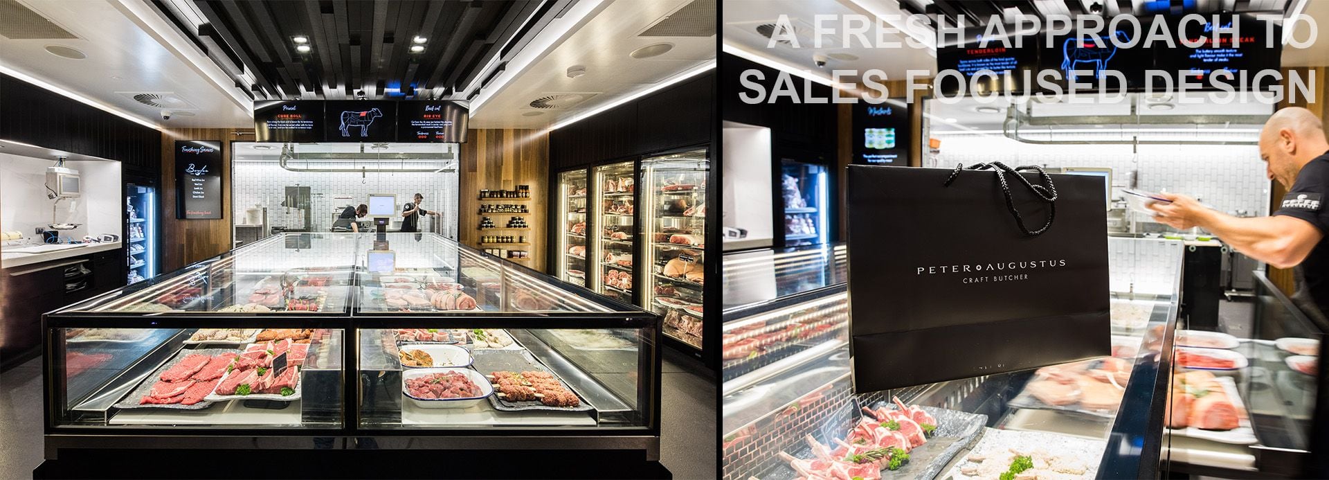
Butchery is a craft. Butchery is a time-honoured skill practised by highly knowledgeable artisans. Creating a craft butchery that challenges design conventions and excites the public with something new and different is something else entirely it is an art.
Challenging the established model
Peter Augustus looks like no other butcher. The first impression one has of this store is that this butcher might have more in common with high-end jewellery. Display cabinets proudly showcase aged rib sirloin, and elaborately marbled wagyu beef cuts are positioned against backlit salt walls. |
|
Bold Design Creates a New, Brand Experience
The Peter Augustus retail concept by Gordon Simmonds from ID Solutions provides a distinct and memorable branded experience for its customers. The breakdown of the established butcher retail model allows a much more engaging and intimate service between customers and expert butchers.
The promise that Peter Augustus has created is providing consistently excellent product along with a service interaction more like a consultation than simple 'counter service'.
If butchery is a craft, then Peter Augustus Craft butcher store in New Farm is a work of art.
| Posted in:New Project |
POSTAL ADDRESS:
PO BOX 623
CANON HILL
QLD 4170
AUSTRALIA
ABN: 16 118 325 447
TEL: +61 (0)419702 472